The original source of this infographic is SampleForms.org and designed by Graphs.net.
How to Optimize Registration Forms
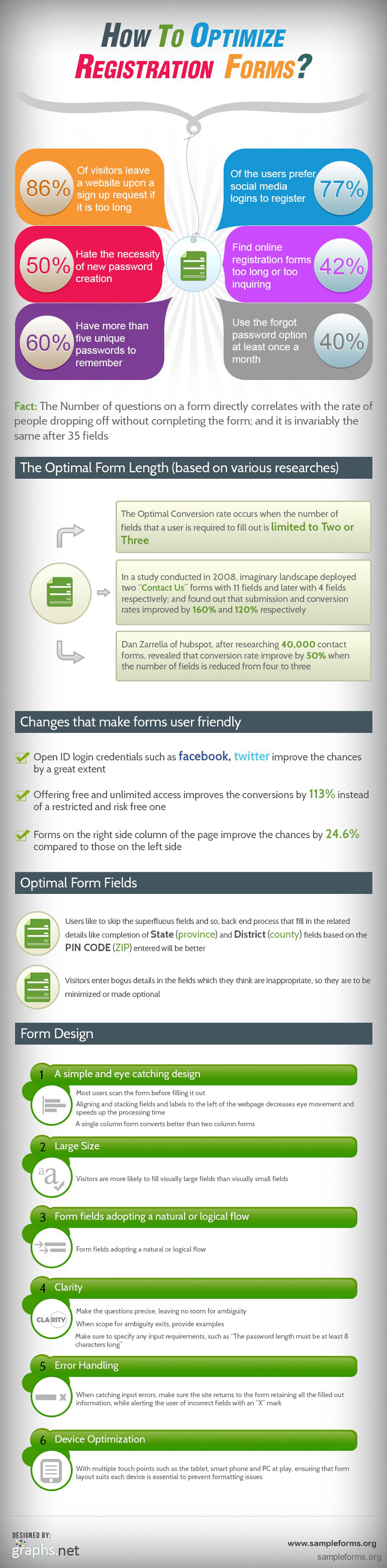
On websites, registration forms ought to be optimized for the benefits of users as well as the owner. The number of people that abandon the filling of online forms is directly proportional to the number of questions. This implies that as the questions increases, the probability that a visitor will not complete the filling of the form increases also.
Research has shown the following:
• Over 80% visitors to a website navigate away upon a sign up request especially if the procedure is long.
• About half the visitors to a page dislike the requirement of creating a new password.
• 60% of users have close to seven unique passwords to remember.
• Over 75% of users prefer using social media logins for registrations.
• Approximately 40% see online registration forms as boring and too inquiring.
• 40% users make use of the “forgot password” feature at least once in a month.
With this information, how can forms be optimized to the owner’s advantage?
To achieve high rate of conversion, the number of fields required by a user to fill a form should be kept at a maximum of three. A research conducted in 2008 by imaginary landscape revealed that out of two “contact us” forms deployed, submissions and conversion rates increased by 160% with forms that has 11 fields and 120% with forms that have 4 fields. Further research by Dan Zarrella of hubspot reveals that with over 38,500 contact forms deployed, conversion improved by 50% as the number of fields were reduced from four to three. So it is obvious that conversion rates increases with fewer entry fields.
In addition to reduced entry fields, there are some features that makes forms user friendly. These are:
• The use of a twitter or Facebook login increases the probability of conversion tremendously.
• Positioning a form on the right hand side of the web page increases conversion rate by 24.6% as opposed to positioning it on the left.
• Conversation rate is increased by about 113% when users are offered a free and unlimited access instead of a free but restricted access.
• From the perspective of the users, there are fields that are unnecessary, users tend to provide bogus information for these fields hence, and these fields should be made optional.
• It is more convenient for the district (country) and state (province) fields to be automatically entered based on the pin code (zip) provided.
Designing the Registration Form
1. A simple and captivating design: it is necessary to pay attention to the slightest detail. Users peruse forms before filling it out so aligning fields to the left side of the page reduces eye movements hence reading is more convenient. Forms with single columns convert better than those with double columns.
2. Fields with large sizes have high visibility and visitors tends to fill them easily when compared to fields with smaller sizes.
3. The logical flow in the filling of forms should not be broken. It must be made as natural as possible.
4. There should be no ambiguity, fields must be made as clear as possible, in extreme cases, pop ups should be used to provide clarity on requirements.
5. The nature of error handling contributes to increased conversion rate. When errors are caught by the forms, the form should return to the original page, retaining the previously entered data.
6. With availability of various touch screen devices like the smart phones, tablets and PCs, website owners should ensure that the layout of their websites is compatible with these devices to avoid issues relating to formatting.
Taking all these into consideration and implementing them optimizes your form and increases conversion rates.
Although millions of people visit Brandon's blog each month, his path to success was not easy. Go here to read his incredible story, "From Disabled and $500k in Debt to a Pro Blogger with 5 Million Monthly Visitors." If you want to send Brandon a quick message, then visit his contact page here.
