Design Features Of The iOS And Android: A Simple Reference
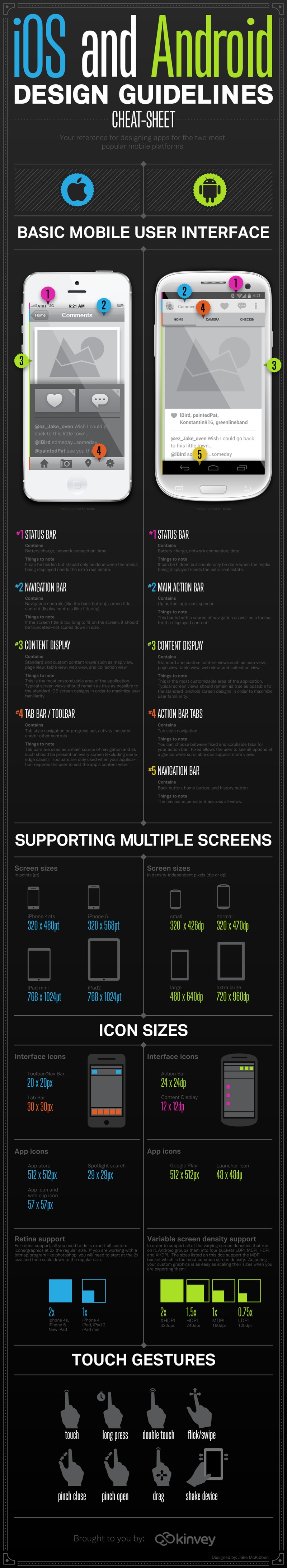
Let’s take a look at the basic mobile user interface. The touch screen design is similar for the iOS and the Android but a few differences can be found beyond just the location of the feature. Keeping these similarities and difference in mind can be useful when considering the functionality of a new app.
The iOS
Taking a closer look at the iOS first:
Status Bar
Located in the upper left corner of the screen and contains battery charge information, network connection and time. It is important to note that this feature can be hidden, but one would only want to do so when displaying media that needs the extra screen space to be viewed properly.
Navigation Bar
Located in the upper right corner of the screen and contains the black button navigational controls and screen title and filtering content display features. It is important to note that if a screen title is too large to display properly rather than down size it, it should be truncated.
Content Display
Contains standard and custom display which includes map view, page view, table view, web view and collection view. It is important to note that this is the most customizable area of any application. A typical screen view should remain true to form to the original iOS screen design in order to maintain user familiarity.
Tab Bar/ Tool Bar
General location is in the lower right corner of the screen and contains tab style navigation or progress bar, activity indicator and other controls. It is important to note that the tab bar is used as the main source of navigation and therefore should be present on every screen to maintain a user friendly interface for the mass majority of iOS users. Note: tool bars are only necessary when the application requires the user to edit the app’s content view.
The Android
Taking a closer look at the Android:
Status Bar
Located in the mid upper right corner of the screen and contains the same information as its counterpart the iOS. Information includes battery charge, network connection and time. It is important to note that it also can be hidden and should only be done when the media being displayed needs the extra space to be viewed properly.
Main Action Bar
Located in the upper left corner of the screen and contains an up button, app icon and spinner. It is important to note that this bar is both a tool bar and a source of navigation for the displayed content.
Content Display
Contains standard and custom view which includes map view, page view, table view, web view, and collection view. It is important to note that like the iOS this is the most customizable for an application. Again screen views should stay true to form to the standard Android form in order to maintain user familiarity.
Action Bar Tabs
Located in the upper mid section of the screen and contain tab style navigation. It is important to note that this navigation style is the same across all views.
Navigation Bar
Located in the lower left corner of the screen and contains the black button, history button and home button. It is important to note the navigation bar is the same across all views.
Special Characteristics
Many designers will want to consider how the iOS and Android support additional screen sizes. The iOS is considered in points (pt) the iPhone 4x4s is 320 X 480pt. The iPhone 5 is 320x 568pt, the iPad mini is 768 x1024pt and the iPad2 is 768 x1024pt. Screen sizes for the Android are in density-independent pixels which are abrogated dp or dpi. The small is 320 x 426dp, the normal is 320 x470dp, the large is 480 x640dp and the extra large is 720 x 960dp.
One last consideration is retina support for the iOS all you need to do is export all custom icons or graphics at 2x the regular size. When working with a bitmap program one would need to start at 2x the size and then scale down to the regular size. When working with Android one must consider variable screen density support.
In order to support all of Androids variable screen densities it is important to know that they are organized into four buckets. These buckets are LPDI, MDPI, HDPI and XHDPI. The most common bucket is MDPI. Adjusting the custom graphics of an application is as easy as scaling their size when they are exported. XHDPI/320dpi is 2x, HDPI/240dpi is 1.5x, MDPI/160dpi is 1xs and LDPI/120dpi is 0.75 x.
Although millions of people visit Brandon's blog each month, his path to success was not easy. Go here to read his incredible story, "From Disabled and $500k in Debt to a Pro Blogger with 5 Million Monthly Visitors." If you want to send Brandon a quick message, then visit his contact page here.