The demise of the sidebar has been overstated over the last couple of years. I have come across several big named bloggers asking the question of, “Is the sidebar even worth having anymore.”
Many of these experts have watched the number of clicks from their sidebars slowly decrease as each year passes. Although these stats are true, the sidebar is as relevant as ever. The reason behind the fall off in sidebar clicks has nothing to do with the engagement rate of the sidebar. It actually has to do with the rise of mobile.
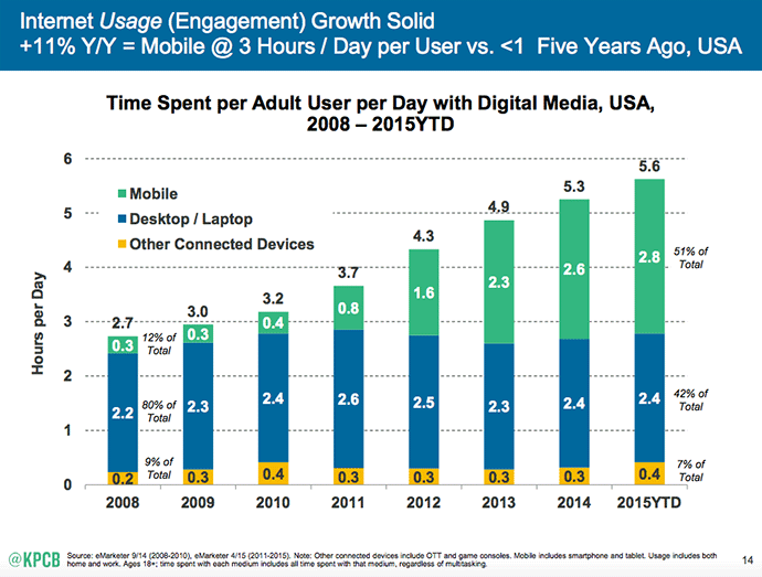
In 2008, only 12% of internet usage came from mobile phones. As of last year, mobile phones now account for over 50% of all internet usage.
Since sidebars are either pushed to the bottom or omitted on mobile browsers, this is the reason why many bloggers have seen a decrease in the total number of clicks generated by their sidebars.
The sidebar still gets prominently featured in almost 50% of all page views, and the average engagement has actually increased over the last five years. The sad fact is that most bloggers do not know how to optimize their sidebars for maximum engagement. Like everyone else, I ignored my sidebar for the entire first year of my early blogging career.
In 2014, I spent a month researching and testing to come up with the perfect blog sidebar formula. I have been refining my formula every couple of months for the last two years.
The 5 Common Sidebar Mistakes Bloggers Make
Before we get into the formula, let us go over the five common mistakes that many bloggers make in regards to their sidebar.
#1 Adding Every Widget That They Can Fit
This usually happens during the launch of a new blog. You get your new premium theme uploaded. Then you go on over to the widgets section to start dragging and dropping every widget that sounds interesting. Before you know it, your sidebar goes on forever and not even a 10,000 word post will showcase all of the widgets that have been jammed into it.
#2 Adding Javascript for Social Media Buttons
This is a mistake that even pro bloggers commonly make. Even if you only add three social media buttons, then you are still left with three separate javascript codes. These have to be loaded every time someone views a blog post. This will usually add an extra two to three seconds on to your load time, which can kill a blog’s chances of ever ranking in Google. If you must let everyone know how many followers you have, then take a screenshot of your buttons before deleting the time sucking javascript. You can chop up your screenshot into separate images, which links to each of your social media profiles.
#3 Having a Blog Roll
Back in 2007, the blog roll was one of the best ways to get inbound links from other bloggers. You post a link to them, and they post a link to you. Sitewide links to other blogs in your sidebar or footer are downgraded by the Google algorithm. So, it does not make sense to even have a blogroll anymore. If you want to link to another blog, then do it off of your homepage or a specific post that relates to the content of their blog.
#4 Blowing Up the Sidebar with Affiliate Ads
Sitewide banners to affiliate ads do not work anymore. You are not going to make money from these ads, and it just looks hideous. Later on in this episode, I will show you the proper way to use a single targeted sidebar affiliate ad for specific posts.
#5 Not Focusing in the Call-to-Actions that Count
There are two key locations on the sidebar that drive all of the traffic and conversions. You have to make sure that your highest converting products and services are placed in these premier spots.
The Right Sidebar vs. The Left Sidebar Debate
Many of the blog themes will give you the option to place your sidebar on the right hand or the left hand side of the post. The eyes will always start from the top left of the post and work downward to the right.
I have tested sidebars on the left hand side and the right hand side. The results of these tests showed that the left hand sidebar received higher engagement than the right hand sidebar. However, the left hand sidebar caused the average time on page to drop by over 25%. The crazy egg heat maps showed that people were not reading the articles as often with the left hand sidebar.
Since time of page is one of the top five factors of the Google algorithm, a left hand sidebar would essentially torpedo any existing or future hopes of Google rankings. With that being said, there really is no debate.
The right hand sidebar is the only choice.
Sticky Sidebars vs. Scrolling Sidebars
A scrolling sidebar is the default sidebar that has been around since the beginning. It scrolls down as the blog visitor scrolls down. When it gets to the end, then it turns to blank white space.
A sticky sidebar will stick at the very end. As the blog visitor scrolls past the end of the sidebar, they will continue to see the last section of the sidebar as opposed to just seeing blank space. When used correctly, the sticky sidebar can effectively showcase your top call-to-actions as visitors finish up reading your posts.
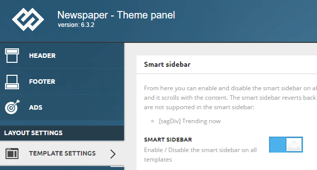
Most premium themes will have this functionality built in, and it is often called a smart sidebar. For example, the Newspaper theme that I use has an on/off button in the template setting section.
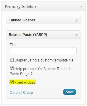
If your theme does not offer a smart sidebar, then you can use the Q2W3 Fixed Widget WordPress plugin. This plugin will allow you to turn a sidebar widget into a sticky widget with the check of a box.
One thing that you have to remember about sticky sidebars is that most advertising companies, like Adsense, do not allow you to place their ads in a sticky sidebar. It is a policy violation that will lead to your account getting shut down. I use Adsense in the body of my posts. I use my sidebar to promote my blog, products and services.
Once again… DO NOT PLACE ADSENSE ADS IN A STICKY SIDEBAR.
The Three Sections of the Perfect Sidebar Formula
Section #1 – Above the Fold
The above the fold section is going to get the most visibility. The reason for this is because not everyone is going to make it to the end of your posts. This is just a fact of life for even the best writers.
The way that I quantify the above the fold section of the sidebar is from the top of the sidebar until the bottom of the fold shows up on a typical desktop computer. This comes out to right around 680 pixels in height.
I tested one, two, three and four call-to-actions in this 680 pixel space. The results showed that using two call-to-actions in this space generates the most clicks and conversions. The statistics also conveyed that call-to-action images, with contrasting colors, generated more clicks than having images that used the same color scheme.
My two call-to-actions above the fold are for my podcast and my about page. Since you also need to know how to create a good call-to-action, I will break down each one.
The Podcast Call-to-Action

The podcast call-to-action uses my show logo paired with a statement on the top half that reads..
Brandon’s Top Rated Podcast Available on iTunes
The middle part of the call-to-action has three quotes from 5 star reviews that read..
I’m loving this content
I am blown away
Value in every episode
Then there is a button with the Apple company logo that says..
Subscribe & Review on iTunes
The podcast is my most important call-to-action, and that is why it holds the top position. Over 50% of the revenue generated from my online course comes from my podcast.
My About Me Page

The second call-to-action that I use in the above the fold section links to my about me page. For this call-to-action, I use an image that incorporates similar elements that are used in Facebook Ads. The top section has a picture of me with a tagline that says..
From brain tumor to 1 million monthly visitors.
It also has some social proof showing that over 45,000 people have recommended the page.
The second section has a headline paired with an excerpt. The headline is as follows…
How I Got to 1 Million
And the excerpt reads as…
After a brain tumor left me physically & mentally disabled, I fought back to regain my health to help my pregnant wife battle stage 3 breast cancer. Two years later I launched my blog using…
I cut off the last sentence and follow that with a “learn more” button.
The takeaway here is that your call-to-actions have to compel your visitors to click. A simple call-to-action that says “find out more about me” is not compelling. You have to pull out that one part of your bio that makes your story special and then try to leverage social proof as often as possible.
Section #2 – The Middle of Nowhere
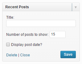
The middle section is going to get ignored 99 out of 100 times. This is the perfect place to stick the widget with your recent posts. Use a widget that only uses text and does not include the featured image. If you include featured images, then you are adding to the page load. Ten recent posts with featured images means ten extra images are being loaded on every page view.
You want to use a recent posts widget in the sidebar because it will help get your new posts indexed fast and high in Google search. Earlier I mentioned that site wide external links to other sites are downgraded by the Google algorithm. The opposite holds true for internal links. An internal link that is on every page of your blog is going to get indexed faster and rank higher in the initial index.
I recommend listing your fifteen most recent posts in the middle section of your sidebar. Your visitors will scroll past the middle as they read, but Google will rapidly index every new post that appears in the sidebar.
Section #3 – The Sticky End of the Sidebar
Just like the top of the sidebar, you will use the same strategy with the bottom of the sidebar. That equates to another two call-to-actions that are sharing a space that is 680 pixels in height.
Although the top section of the sidebar will have the most visibility and clicks, the end of the sidebar is going to have the highest conversion rates. The reason behind this is that most people that reach this point have just spent 5 to 20 minutes reading one of your blog posts. Once a visitor has done that, they trust you and see you as an authority on that specific topic.
In my sidebar A/B tests, I was able to find another big stat that stood out. The bigger the ask was, the further down it had to be on the sidebar. The top part of my sidebar is asking my visitors to listen to my free podcast and read my personal story. Both of these call-to-actions are asking for a low level commitment.
The bottom of my sidebar has call-to-actions to landing pages that ask for a higher level of commitment. One landing page is for signing up to my paid online course, and the other is asking to schedule a free consultation to go over my marketing services. If someone is visiting my site for the first time through a Google search, then you can see how the top section would not be the right time to request the bigger ask.
So let’s take a look at the two call-to-action images that I use in the bottom section. The sticky smart sidebar places these perfectly to the right as each visitor finishes up reading a post.
The Online Course
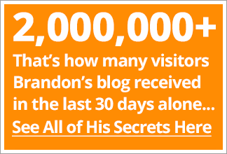
For my online course call-to-action, I used a white text on orange background to draw the eyeballs to the first call-to-action of the bottom section. I start with a header that says..
2,000,000+
Then I follow it up with a sentence that reads..
That’s how many visitors Brandon’s blog received in the last 30 days alone.
Then I highlight the following text call-to-action by underlining it and giving it the same appearance as an internal text link. It reads..
See All of His Secrets Here
This image ad was pure text. There was no reason to waste space with a stock image, which would add zero value. Just in case you are wondering, I A/B tested the text image versus the text image with a stock image. The results of that A/B test were not even close.
The Free Consultation

For the second call-to-action, I used a text based image paired with a yellow button on a white background to promote the free consultation. The image has a gray border around it to add extra contrast. The first sentence uses orange text, and the second sentence uses black text. This is another contrast technique that draws the eye.
The first sentence in orange text reads..
Let Brandon help you build your website traffic to new levels.
The second sentence in black text reads..
His blogs & his clients’ blogs had four million visitors last month.
Instead of using the same underlined text as the online course call-to-action, I chose a gold button with a calendar icon that reads..
Schedule a Free Consultation
The two call-to-action images work together to draw the reader over after they finish up reading a post. Both ads leverage social proof numbers that drive visitors to click and find out more.
Alternative Call-to-Actions for the Sidebar
If you do not have your a podcast or products of your own, then here are some other call-to-actions that you can use for the sidebar.
Use Pillar Content to Showcase Your Best Posts
A blog’s pillar content is typically made up of a handful of posts that have been statistically proven to be of high value. They have shown to have some of the highest time on page and lowest bounce rates. The total shares are also off the charts. These posts are where you put your best foot forward. Typically, they are long form posts with well over 2000 words. If you had nothing to sell your visitors, then you could use your pillar content for the prized locations in the sidebar.
Add an Email Capture to Build Your List
You can easily turn one of your pieces of pillar content into a lead magnet. Then you can use the top section or bottom section for a perfectly placed email capture. Since lead magnets take up a little bit more space, I recommend using one large email capture that will take up all of the 680 pixels of the top or bottom sidebar location.
Chris Ducker fills up his above the fold sidebar section perfectly with this email capture..

The pillar content and email captures are perfect for bloggers that are just starting out. This allows you to showcase your best posts to your growing audience while building your email list at the same time.
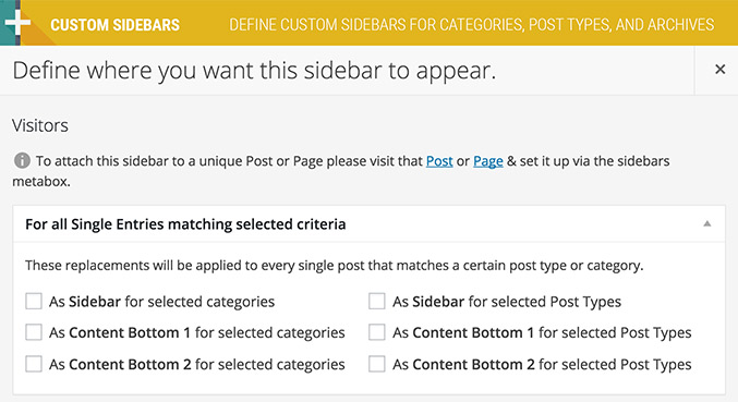
Creating Custom Sidebars for Categories and Posts
Earlier on, I mentioned that I would reveal the right way to promote affiliate programs in the sidebar. Sitewide affiliate ads died many years ago, but the targeted affiliate ad still lives on today. Unfortunately, most people just do not take the extra step that needs to be taken.
There is a WordPress plugin that allows you to create a custom sidebar for any and every page of your blog. This works perfectly for blogs that write tutorial and tip posts about specific products with affiliate programs. The plugin is called Custom Sidebars.
I will use an example of an affiliate program that has been promoted through posts on more blogs than almost any other affiliate. Ever since Pat Flynn let it be publicly known about how much money he makes from Blue Host, there has been a stampede of bloggers attempting to duplicate his success. This is typically done by writing a post explaining how to set up a WordPress blog via Blue Host. A sticky custom sidebar with one or two call-to-actions, paired with a special discount code, would work perfectly to increase conversions for this type of post.
If you do not want to set up custom sidebars for specific posts, then you can do it by category. The email marketing category might have an AWeber affiliate call-to-action sidebar, and an SEO category could have a custom call-to-action sidebar featuring SEMRush.
Another great use of the custom sidebar is to rotate out different sidebars for the posts that you are sending to your email list. You can show the same sidebar to everyone coming to your posts from a Google search because the majority are visiting your site for the first time. The people on your email list have seen your sidebar before, and they will get click fatigue after seeing the same sidebar two or three times. By rotating in new sidebars for posts that are emailed to your list, your subscribers will continue to click on the sidebar call-to-actions at the same high rate.
Although millions of people visit Brandon's blog each month, his path to success was not easy. Go here to read his incredible story, "From Disabled and $500k in Debt to a Pro Blogger with 5 Million Monthly Visitors." If you want to send Brandon a quick message, then visit his contact page here.