Having a mobile presence is no longer an option for any type of business. There are many companies that are yet to have a mobile presence and many that do have a presence do not really have an effective mobile website. People who use smart phones have a penchant to shop online using their mobile devices. If a business wants to grow and intends to increase its sales then it should have a formidable mobile presence.
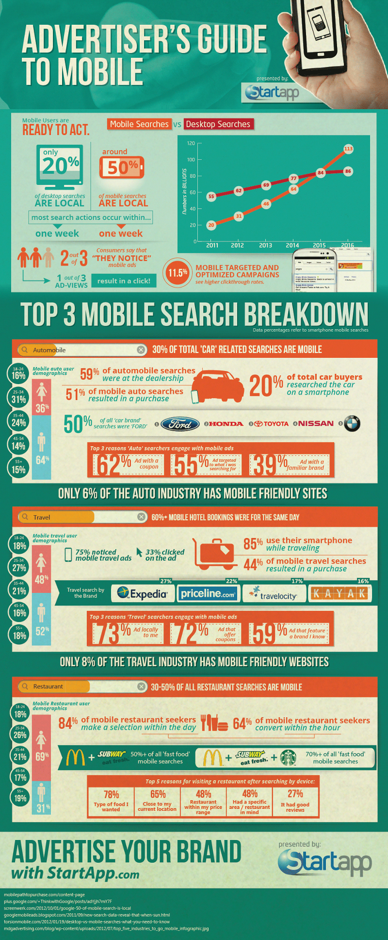
The below infographic outlines the trends and statistics of mobile advertising and the top searches performed.
Interacting with a Responsive Website
A responsive website that can fit into a mobile device and its display without any hassles is definitely the start. But that is not ballgame here. You need a mobile website that offers the most fascinating, simplest, convincing and rewarding user experience possible. Today, shoppers are increasingly impatient, attention span is unprecedentedly short and most shoppers wouldn’t indulge in an iota of inconvenience. Thus, every element of your mobile website, quintessentially the design, must be perfect.
The adjoining slide share would introduce you to 25 design upgrades that would make your mobile website a money spinner and your revenues would skyrocket. Something as simple as font size, spacing, negative space, resolution of images and clarity of the content can be the difference between a view and a click, a rejection and a sale.
Websites have to be responsive today which means that a website can be viewed on desktops, laptops, mobiles or smart phones and tablets. But that alone wouldn’t do the trick. The responsive websites should have all the features appear as they are on the different devices, in this case on mobile devices. Also, the website must be optimized to be viewed in portrait and landscape versions of display on smart phones.
The layout of the entire mobile website must be optimized for different screen sizes because what may appear to be super large on a certain smart phone screen may appear to be super small on a tablet or a larger smart phone screen. Every part of the layout wherever applicable should have clickable icons and not static or dead ones, hovers should be viewable on mobile websites as well and call to actions should be well defined and not confided in nonessential information. Mobile websites must be informative, just as traditional websites are, but what matters more is the omnipresence of utility features and the obvious facilities that the user would look for.
Explore the 25 design upgrades and offer an amazing experience to your potential customers so they end up buying.
Although millions of people visit Brandon's blog each month, his path to success was not easy. Go here to read his incredible story, "From Disabled and $500k in Debt to a Pro Blogger with 5 Million Monthly Visitors." If you want to send Brandon a quick message, then visit his contact page here. Brandon is currently the CEO of Aided.