You may be asking yourself right now, Do I really need to read an entire blog post about the button?
Fortune 5000 companies spend millions of dollars designing and testing online call to action buttons every year. While almost all this money is spent on the “buy” button, we can leverage their findings to dramatically increase the conversions rate of our email opt-in boxes.
Two elements of the button have a profound impact on conversions rates. The first is the color and the second is the phrase used on the button.
The Color that Drives the Most Subscribes
Let’s start with the color.
If you’re wondering if color really has an impact, I want to share with you the tale of two colors, red and blue.
There have been numerous studies on the effect these colors have on our physical and emotional response.
The first famous study looked at the impact the color of a room had on blood pressure, respiration, and heart rate. The red room raised blood pressure, increased the speed of respiration, and elevated the heart rate. The blue affected the subjects in the opposite way; it reduced blood pressure, respiration, and heart rate.
The second study looked at the impact red and blue had on cognitive performance. Each participant had to perform tasks with words or images displayed on red, blue or neutral backgrounds. The red groups did a better job on memory recall and attention to detail. The blue group did better on tasks that required imagination. An example of one these tasks from the experiment was creating uses for a brick and creating toys from shapes.
Because of these clear findings, the top marketing firms in the world pay close detail to the psychological impact of every color they use.
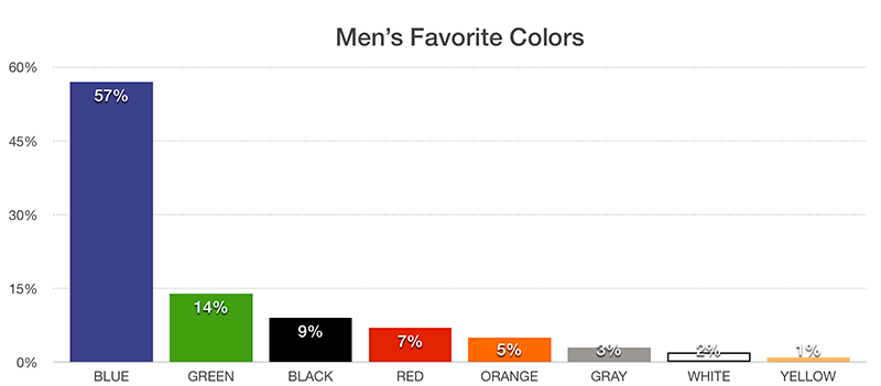
Let’s look at one of these details, which would be the preference of color by gender. Joe Hallock did an extensive study on this area and found that blue was preferred by both male and female.
For men, blue was preferred by 57% of the group. It was followed by green at 14%.
For women, blue was preferred by 35% of the group. It was followed by purple at 23% and green at 14%.
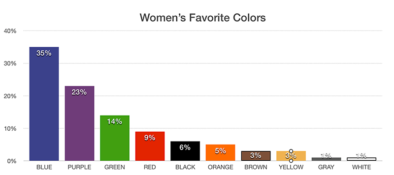
So, the clear takeaway is that blue is the preferred color of the vast majority.
The story of color for your button does not end with blue. In multiple large A/B studies, it was found that the contrast of the color played the largest role in driving conversions.
An example of this can be seen in an A/B study by HubSpot. They tested a red button against a green button on a landing page with a green logo. The red button substantially outperformed the green button because the green button did not contrast with the primary color used in the logo. Essentially, the green blended in with the rest of the layout of the landing page. Since there was no red on the landing page, the red button jumped out and demanded to be clicked.
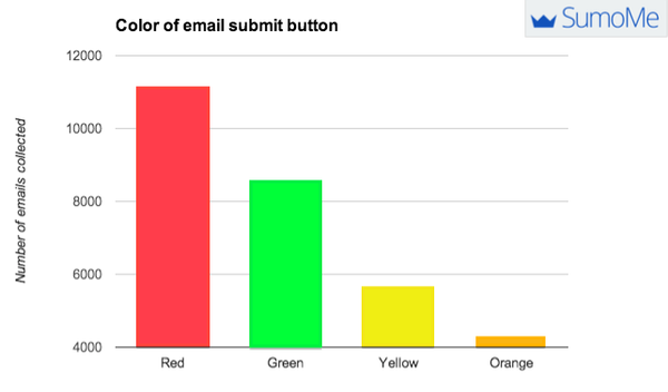
Another study by SumoMe looked directly at how the color of the button affected the number of email collects from opt-in boxes. The results identified that the red button outperformed them all.
Even though blue is the preferred color of both sexes, it will not drive your visitors to subscribe to your email list. Blues are great to use for your color scheme and logo. That is the reason the most popular color in Fortune 5000 logos is blue. On top of being preferred, blue logos make people feel a sense of trust and dependability.
As long as red is not a dominant color in your logo and blog design, then the ideal color of your subscribe button should be red.
Now that we know the color, let’s figure out what words we should put on our red subscribe button.
The Three Words to Avoid on Subscribe Buttons
Here are the words to avoid:
Submit or Sign Up or Subscribe
These three are what I call the default words for buttons. Most forms and email captures will have one of these three words as the default word. Since most bloggers do not take the time to change this, these three words dominate button text across the internet. Anything that is seen all the time gets ignored.
Order or Buy
You are probably not going to accidentally put this on your subscribe button, but I feel I should mention it as words to avoid. If you are selling anything, then stay away from using these words on your call to action button. You are reminding them of the cost when you should be reinforcing the benefit.
For instance, I do not use “buy my course now” on the button to process the credit card payment for signing up for my online course. Instead, I use “I want instant access to the course.” Two more concise variations of this are “I want it” and “get instant access.”
Our and Ours
This word is impersonal. A good alternative is to say you or yours, and the best alternation is to use I, me, or my.
The Four Emotional Triggers that Turn Visitors into Subscribers
The next thing we must know are the four emotional triggers that work best in converting visitors into subscribers, and what works best on buttons for each of these.
#1 Hope
Hope is most frequently used in giveaways and competitions.
For example…
Title:
Enter to Win a 1-on-1 Coaching Session
Text below title:
I am giving away $1000 worth of coaching sessions this month. All I need is your email address.
Words on the Subscribe Button:
I Want to Win the Coaching Session
Here are some of the high converting words associated with hope that you can use around and in your buttons…
Proven
Safe
Start Now
Learn
Discover
Build
Grow
Guarantee
#2 Exclusivity
This is often used when you let people know that they will be part of a special club with benefits by joining your list.
Here is an example…
Title:
Join My Private VIP Facebook Group
Text below title:
You will have direct access to me along with exclusive swipe copy.
Words on the Subscribe Button:
Make Me a VIP
Here are some of the high converting words associated with exclusivity that you can use around and in your buttons:
Subscribers Only
Featured
Exclusive
Members Only
Membership
Access
Invitation
#3 Scarcity
This psychological tactic is used all the time by bloggers that use webinars to build their email list.
For example…
Title:
My Next Masterclass Webinar is About to Start
Text below title:
There are only 17 spots left. Reserve your seat before it is too late.
Words on the Subscribe Button:
Yes, Reserve My Seat Now
Here are some of the high converting words associated with scarcity you can use around and in your buttons…
Expires Soon
Limited
One Time Only
Ends Tomorrow
Now
Last Chance
#4 Social Influence
This leverages the power of the crowd to get your visitors to jump on board with everyone else, and this revolves around the growth hack from the last episode.
For example…
Title:
Join 11,821 Bloggers that Receive the WordPress Tip of the Week
Text below title:
These tips will increase your traffic and make you more money.
Words on the Subscribe Button:
I Want to Double My Blog’s Traffic
The social influence emotional trigger is the only one where you can include the number of people that subscribe to your list. When you sign up to receive a free coaching session with the hope trigger, you do not want to hear that thousands of other people are also entering. The same goes the exclusivity and the scarcity emotional trigger. However, all four of the emotional trigger email opt-ins will benefit from a strategically placed testimonial.
I wish the words were as simple as telling you to make the button red. However, at least you know the words to stay away from along with four proven formulas.
Although millions of people visit Brandon's blog each month, his path to success was not easy. Go here to read his incredible story, "From Disabled and $500k in Debt to a Pro Blogger with 5 Million Monthly Visitors." If you want to send Brandon a quick message, then visit his contact page here.