Having a lead gen form on the company website is imperative? Many companies choose to use the contact page or the inquiry form as the lead gen form. Many resort to the newsletter subscription option. Whatever is your strategy, you need a lead gen form. One of the most effective ways to have a lead gen form is to make it very well defined. You must be lucid with the exact purpose why you are asking for the details or why the visitor is furnishing the information. Else, there is some scope of misunderstanding.
No matter where and how you put forth a lead gen form, it must be perfect. You cannot go on asking twenty different questions and you cannot do with just an email address. Many companies get just the email while asking people to sign up for their newsletters. That works but a bit more details would help. You don’t just want subscribers. You want leads.
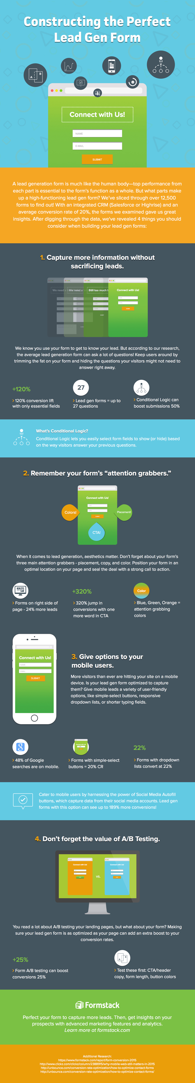
1) Make it a Phased Process.
When you put forth a large form or just a small tab for an email, you defeat the purpose as the visitor gets mislead. The visitor may feel overwhelmed when asked for all those information or may feel that just furnishing the email would do it when there is clearly a need for many more details. You should phase it with the name and email at the first step and then a few other details in the second step. There can be two to three steps in total.
2) Give Options.
Whenever you keep asking for more details, other than name and email, you should have it as optional. You can always club the leads that you have emails for and have more prospective databases for which you have more information, such as phone number or perhaps even the address. There is no law that says you need to have only one database with every field of information attended to.
3) Think About Design.
You need to come up with the right kind of design for the form, with the right colors, place it well and you must not have anything on the form or elsewhere on display on the website that will detract the audience. Use bright or compelling colors, use AB testing to know which design works better, have simple and neat forms which are more convincing than compelling. Compelling is undesirable.
Although millions of people visit Brandon's blog each month, his path to success was not easy. Go here to read his incredible story, "From Disabled and $500k in Debt to a Pro Blogger with 5 Million Monthly Visitors." If you want to send Brandon a quick message, then visit his contact page here. Brandon is currently the CEO of Aided.