How To Optimize Contact Forms For Conversions
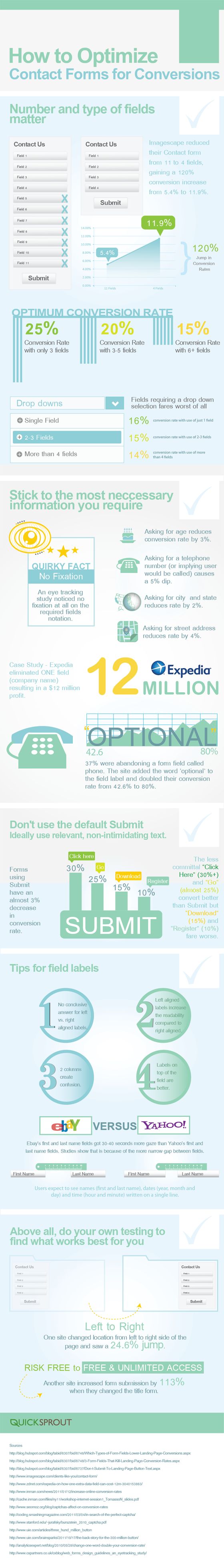
When building contact forms for your business website, there are a number of different aspects to consider. Number and the type of fields matter.
Do not add unnecessary fields in your contact forms. When Imagescape reduced their contact form fields from eleven down to four, they gained a 120 percent conversion increase from 5.4 percent to 11.9 percent. This is very significant.
Here are the optimum conversion rates: There is a 25 percent conversion rate with contact forms with only three fields. There is a 20 percent conversion rate with contact forms with three to five fields. There is a 15 percent conversion rate with contact forms with six or more fields. Obviously people prefer contact forms with fewer fields.
Drop downs are the worst contact form element. Fields that require a drop down fare the worst of any contact form element. There is a 16 percent conversion rate with the use of just one field, a 15 percent conversion rate using 2 or 3 fields and a 14 percent conversion rate using more than four fields with drop down menus.
You should always adhere to only the most necessary information that you need. People rarely pay attention to the required fields notations. Asking respondents for their age will reduce your conversion rate by 3 percent. Even implying that a user will be called causes a 5 percent conversion drop.
Asking for a city and state will lower the conversion rate by 2 percent. Asking for a street address lowers it by 4 percent.
Here is a case study: Expedia eliminated just one field from their contact form. This resulted in a $12 million profit!
37 percent abandoned the form field for the phone number. The website added the word optional next to the field and it doubled their conversion rate from 42.6 percent to 80 percent. Amazing what just that one little word can do!
Changing from the default word Submit can make a difference as well. You should choose less intimidating, more relevant text for the submit button of your contact form. Forms that use Submit for this submit box text have nearly a 3 percent decrease in the conversion rate. Click Here is a less committal text and has 30 percent better conversion rate.
Go has a 25 percent better conversion rate, Download is at 15 percent and Register has a 10 percent conversion rate. Clearly it is better to never use the Submit text.
Tips for field labels
1. Do not have a conclusive answer for left versus right aligned labels.
2. Left aligned labels will increase the readability of text compared to right aligned.
3. Two columns can create confusion.
4. Labels on the top of the field are usually better.
Although millions of people visit Brandon's blog each month, his path to success was not easy. Go here to read his incredible story, "From Disabled and $500k in Debt to a Pro Blogger with 5 Million Monthly Visitors." If you want to send Brandon a quick message, then visit his contact page here. Brandon is currently the CEO of Aided.
