Mobile Optimization For Small Businesses; A Quick Guide
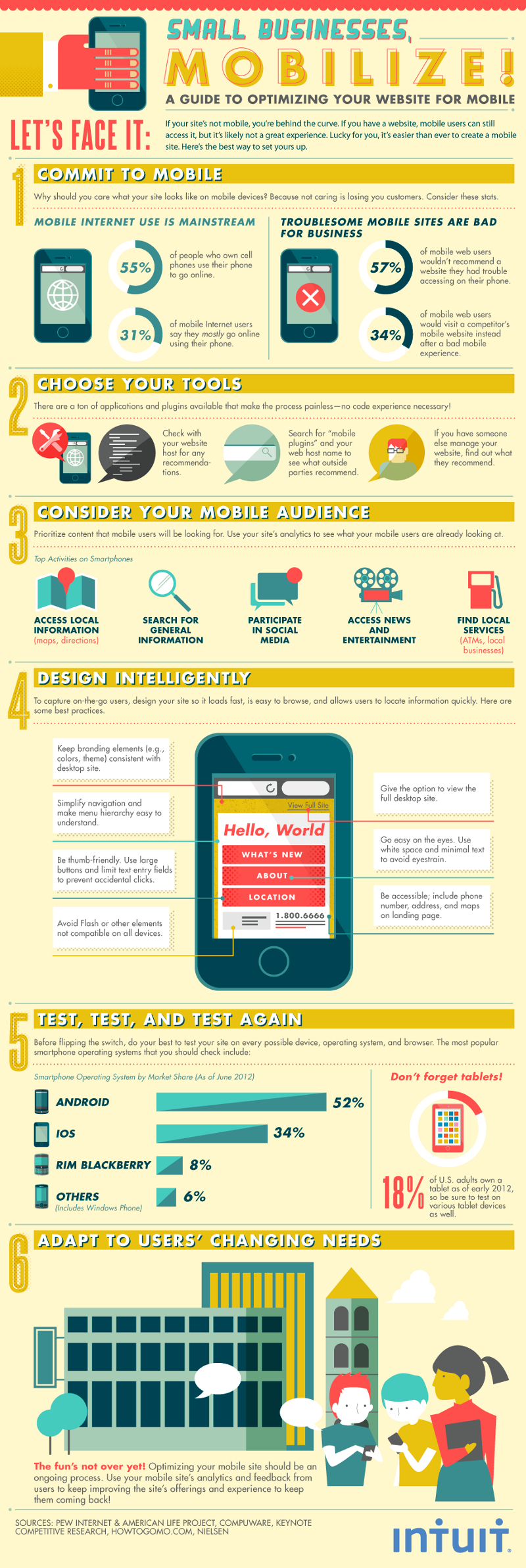
In today’s age of smart phones and tablets, the demand for mobile data access is skyrocketing. As an ever growing number of people access data through mobile platforms, companies without websites optimized for mobile access are beginning to fall behind the development curve in a big way. To emphasize how pervasive mobile internet use is, consider that over half of cell phone owners use their phones to access the internet, and that with the growing power and affordability of internet-capable phones, nearly a third of all mobile internet users prefer to use their phones to go online. The way to maintain these potential clients’ interest is through mobile optimization; making your site mobile compatible.
Why Mobile?
While mobile devices can access traditionally formatted websites, the difference in screen resolution, input devices and platform code mean that such sites are too cumbersome to work with from a mobile user’s perspective. A third of mobile web users would gladly use a competitor’s mobile website rather than struggle with a poor mobile experience with another company. So how should a company begin to ensure a positive experience for mobile users?
Target the Demographic
The first step is to understand the target demographic to prioritize content and features that mobile users are looking for. While your current website’s analytic functions can show what mobile users are looking at for your site specifically, some common activities for mobile users include searching for maps and directions, looking for local stores and services, and general information gathering.
Design Simple
With this information in mind, designing a mobile website should be simple and intuitive. Naturally, branding and color schemes should emulate the desktop site for consistency and easy recognition. The option to view the full site should be available to avoid alienating those who prefer the more familiar layout. Furthermore, keep basic information like phone numbers, address and location on the landing page to stay accessible. Use minimal text to save screen space and limit eye strain; brief is better!
User Navigation
Navigation and menu hierarchy should be kept simple. Remember that thumbs are less precise than a mouse and keyboard, so make buttons large and limit text fields to prevent accidental clicks. Flash and other elements that might not be compatible on all devices should be avoided.
Test It
Once you have a working site up and running, don’t forget to test it often. Your website should run smoothly on every smartphone operating system as well as on tablets. Remember that as users’ needs change, so should your website. User feedback and the mobile site’s analytics can guide you in the right direction.
As you can see, Mobile Optimization is a simple process that can stop you from losing customers. Start your search for mobile plugins for your website host or ask for your website’s manager’s recommendation for your starting point and optimize today!
Although millions of people visit Brandon's blog each month, his path to success was not easy. Go here to read his incredible story, "From Disabled and $500k in Debt to a Pro Blogger with 5 Million Monthly Visitors." If you want to send Brandon a quick message, then visit his contact page here.