Battle of the Fonts, Serif Vs. Sans
Do you do typing a lot for both websites and hardcopy prints but are unsure what fonts to use? Many people cannot differentiate between fonts that should be used for web based pages, as compared to those that are clearly visible in printed hard copies. A piece of advice from people who have been in the print industry for long is that, you should never use a print which will leave readers struggling to identify the font but rather have them see the message instead. If you can accomplish that, you are then on the brighter side of satisfying more audience than before. Here are some of the sharp differences between sans and serif, which is the most commonly, used fonts today in prints.
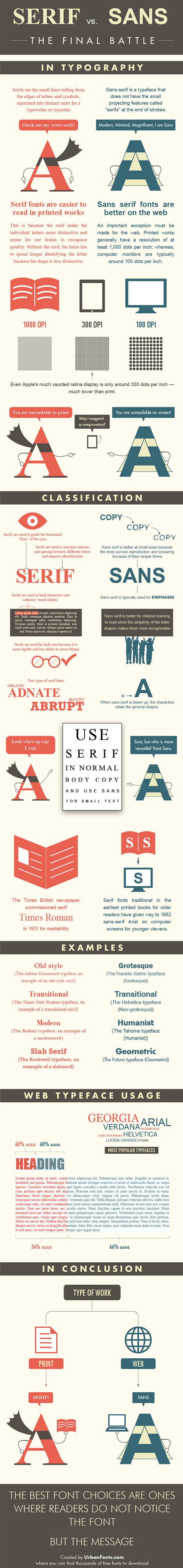
Legibility
The first difference between sans and serif are the faces. The serif font has the face with small lines with distinctive curves and tails that are purposely made for a typewriter and keyboard. The tails and curves in serif add in a little beauty to the piece of text in place. Sans on the other hand have a bold face with no tiny lines or curved to make it beautiful. Sans is most applicable in prints in websites, which makes all words and letters legible to the reader. It is due to these factors that make most experienced users prefer using serif fonts when typing documents to be printed as a hard copy. For website developers and content writers, sans plays a major role in that, it brings out the boldness in a word, and one doesn’t have to struggle in any way while reading a post on the web in the sans font.
Photocopying
The other place where this battle surges on comes when one needs to make multiple copies of a document. With the serif font, serifs have been put in place to help the eyes identify the flow of letters and words horizontally. This means that, copying documents in the serif font retains its original quality because the DPI in photocopiers can identify these fonts easily. Copying documents printed in sans tends to compromise its quality in that, the font tends to fade away as more copies are made from a single paper. It then means that this font will not be eligible if a single copy is to be photocopied over an extended period of time. Nevertheless, sans is great to use if for children who are learning how to read. This is because the serifs may deter a child from identifying a letter correctly, especially from a group of letters.
Conclusion
In conclusion to the above based factors, it is important for one to have a clear insight on where a document will be used before selecting a font. Since all fonts are based on the two, sans and serif, choosing the right one for your job will determine how legible they will be. It is due to this reason why newspaper companies major in using serif fonts in their hardcopy of the paper, while change the same to sans for the soft copy which is accessible through the internet.
Although millions of people visit Brandon's blog each month, his path to success was not easy. Go here to read his incredible story, "From Disabled and $500k in Debt to a Pro Blogger with 5 Million Monthly Visitors." If you want to send Brandon a quick message, then visit his contact page here.