Most Recommended Posts:
24 Must See Social Media Marketing Infographics
17 Incredible SEO Infographics
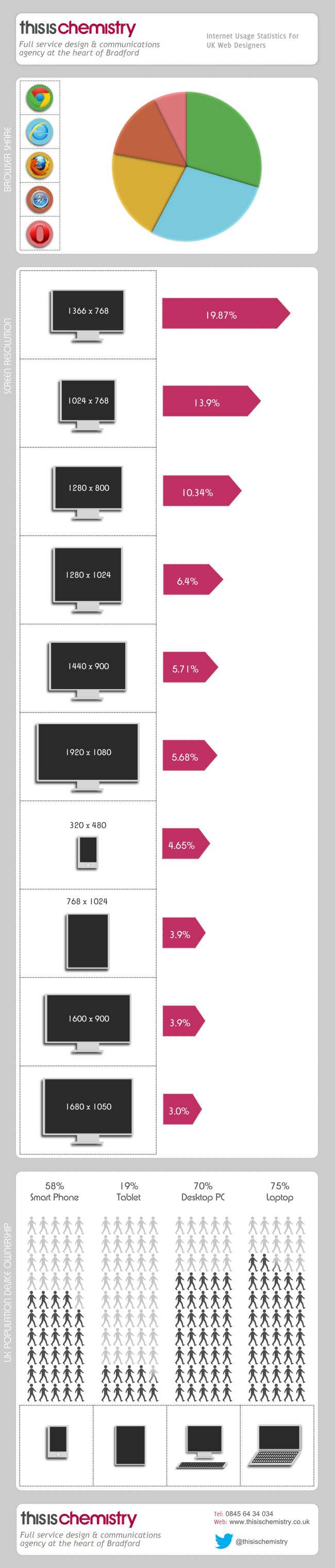
The Importance of Knowing Display and Usage Statistics
If you want to make a fantastic first impression with your website, you’ve got to know how your targeted visitors are viewing your website. Are they on a mobile platform? Are they using a widescreen monitor with a PC desktop? Maybe it’s an Apple MacBook Pro? Each type of monitor, platform, and browser can offer a different user experience when it comes to navigating your website. If you haven’t this information into account in your overall design, you could end up losing business that could have been yours to your competitors.
Though each website and targeted visitor group relationship is unique and different, here’s a look at some overall statistics on usage and ownership within the United Kingdom.
Most People Still Use Internet Explorer
Despite Google Chrome blowing up the internet world and the way that web browsers function, the marketplace leader is still Microsoft’s Internet Explorer. Mozilla Firefox and Apple’s Safari browsers also have a fair portion of the browser market, which means each browser should have some design elements incorporated with your website’s coding. If you choose to ignore Firefox, for example, you could potentially lose 20% of your potential customers! In real visitor statistics, if you get 20,000 hits on your site per day, you could be potentially losing 4,000 hits by not having a good user experience through Firefox. With a 2% conversion rate, you’re potentially losing 80 customers every day. What is your average sale?
Big Monitor Screens Are Not the Most Common
One of the more common themes in modern website design is to format the page so that it looks great on a widescreen. It’s also an easy way to incorporate more information on a home page or a landing page so that you get more stuff above the fold that might create a conversion. Though widescreen monitors might be the future of web browsing, the reality is that only about 10% of users actually use them for their internet browsing. Most people still use standard sized monitors, so a widescreen formatted website with no user experience coded in for standard monitor users could potentially give you a bounce rate of 90%.
Almost 60% of People Have Smartphones
Mobile website design is more important than it has ever been before, and as smartphone technology becomes cheaper and more accessible for everyone, that curve on that trend is only going to steepen. Almost 6 out of every 10 people own a smartphone and many of these people use mobile applications to access the internet in a variety of ways. If your website is accessed on a smartphone and it provides a lousy experience, statistics show that 80% of those people will never visit your website again. That’s 8 out of 10 potential customers that could end up buying what they need from a competitor!
How Does This Information Help You?
By knowing how people are accessing your website, you can work to make sure you have provided a good user experience to everyone. Why allow a poor user experience to affect your revenue stream or change how the information on your site is viewed? With this information, you can tailor your website design so that it provides a maximum amount of benefit to all of your targeted visitors.
Although millions of people visit Brandon's blog each month, his path to success was not easy. Go here to read his incredible story, "From Disabled and $500k in Debt to a Pro Blogger with 5 Million Monthly Visitors." If you want to send Brandon a quick message, then visit his contact page here.