Studying Fonts And Colors Of Top Brands
What exactly makes the world’s biggest names in consumer goods so incredibly successful? When studying fonts and colors of top brands, there are many points to consider. From logo design to font style to the combination of both, it will all be discussed in detail here.
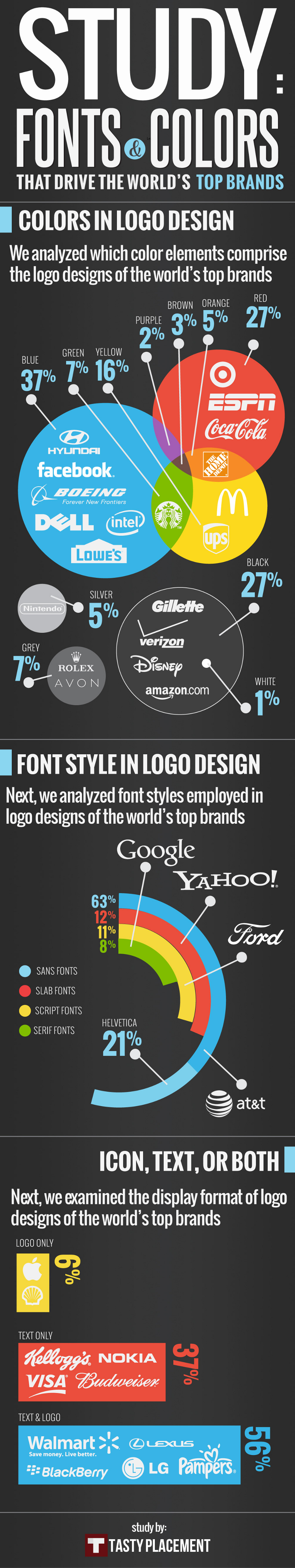
Color Elements
It is interesting to note the color elements that make up the parts of the logo designs from internationally recognized brands. Coming in first place at 37 per cent in the color race is bold blue by a rather slight margin. Highly lucrative brands such as Facebook, Dell, Lowe’s Home Improvement Store, Intel, Hyundai and Boeing invoke the color blue in their famous designs.
Second place is actually a tie, but we will first look at ravishing red. With 27 percent, the color of choice for brands like Target and the sports channel ESPN is certainly a show stopper. Perhaps the most famous use of this fiery hue is with the Coca-Cola brand. Renowned worldwide for over a century, Coca-Cola clearly is doing something right.
Also landing second place with 27 per cent is the simple, always modern choice of black. Disney is another staggeringly legendary brand that has stood the test of time. They, along with Gillette, Verizon Wireless and Amazon.com cherry picked black to represent their brands.
Internationally renowned corporations like McDonald’s and UPS call upon the sunniest, happiest color to front their logos. Yellow is the third most popular logo color choice at 16 per cent. Seems odd that it would be below black, and yet there it is.
Font Style
Font style is also a major player in the success or failure of a logo design. Serif fonts are the least used at 8 per cent. However, it is very surprising that the technological behemoth Google utilizes this least likable font.
Script fonts are second from the bottom of font style choices at 11 per cent. Script fonts are what they sound like: they mimic handwriting. The automobile corporation Ford fancies this font.
Slab fonts are bigger and bolder in design. They still rock the bottom of the list at 12 per cent. Yahoo! is an example of a logo design incorporating a slab font.
Most widely chosen by a landslide are sans fonts. It seems strange that these are both the most popular at 63 per cent, yet also the plainest. AT&T is one of many corporations to use a sans font style. Specifically, the font Helvetica makes up 21 per cent of the sans fonts used in top brand logo design.
Elements to Incorporate
The last thing to consider in studying fonts and colors of top brands is whether the logo includes just icon, text or both. It is hard to convey a brand with just a logo. Only 6 per cent do this. 37 per cent use text only while 56 per cent utilize both text and logo.
Although millions of people visit Brandon's blog each month, his path to success was not easy. Go here to read his incredible story, "From Disabled and $500k in Debt to a Pro Blogger with 5 Million Monthly Visitors." If you want to send Brandon a quick message, then visit his contact page here.