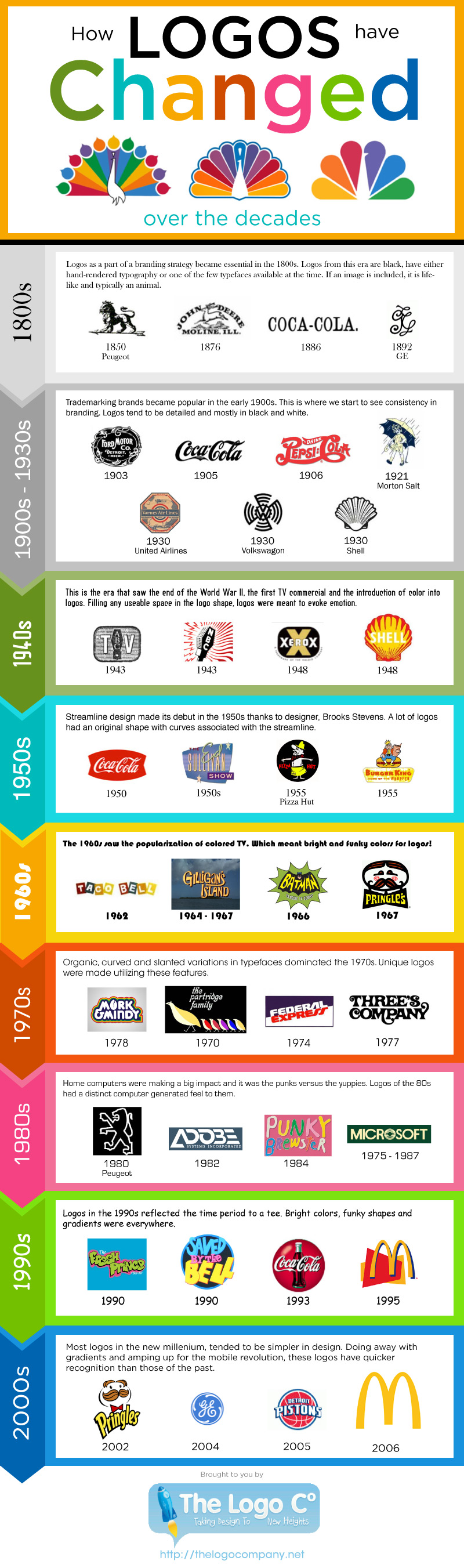
If you want to truly appreciate the evolution of logos, look no further than the logos that have been used through the years for NBC. The television giant has emphasized the rainbow feathers for many of their logos, but they have occasionally tried to change their logo completely.
For some companies, completely transforming a logo can be an extremely positive move. For other companies, it can be an absolute disaster.
Companies often have to take care, when it comes to maintaining a logo that is not only in step with the times, but isn’t so different as to turn people off the brand completely. Some brands have maintained a fairly consistent logo through the decades. Other brands have had to change things up with the passing decades, which can create a fascinating history of corporate marketing and brand recognition.
At any rate, the evolution of logos can prove to be a deeply compelling look into history.
The History Of Logos
Take a look through the last century and change of corporate logos. You’re going to notice a few things that are definitely of interest:
1800s: During the 1800’s, the logo became a crucial component to creating a successful branding strategy. Logos during these years tended to be black. The typography was generally created by hand, although a few typefaces were indeed available at the time. Images were usually very realistic, often depicting an animal.
1900s-1930s: Brands becoming trademarked became a consistent thing during these decades. Logos in this era were very detailed, and were still generally black and white.
1940s: As the 40’s dawned and eventually closed, the world went through a war, and logos started taking on a bit more color.
1950s: It was in this decade that the streamline design was introduced and quickly popularized.
1960s: As the 60s introduced color television, logos started taking on more vibrant colors and imaginative designs.
1970s: In this decade, it was likely that the logos you came across utilized organic, curved, and slanted variations. These elements allowed for designers to create some truly unique logos.
1980s: As home computers became more and more popular, logos often took on a slightly computerized aesthetic.
1990s: .The logos at this point definitely reflected the decade itself. Brilliant colors and funky shapes dominated the landscape.
2000s: Gradients fell by the wayside in the 2000’s. Logos in the 2000’s reflected simplicity, as well as the company’s desire to establish immediate, positive recognition with their particular brand.
Although millions of people visit Brandon's blog each month, his path to success was not easy. Go here to read his incredible story, "From Disabled and $500k in Debt to a Pro Blogger with 5 Million Monthly Visitors." If you want to send Brandon a quick message, then visit his contact page here.