Retina Display & Your Website
The huge innovation in today’s technology has greatly become evident. There are a number of gadgets introduced that fulfills the requirements of most individuals. Apple is one of the most popular and leading companies to distribute it such innovation. Now, Apple already has its new technology involving the pixel and resolution density of devices. This technology is called Retina Display.
Defining Retina Display
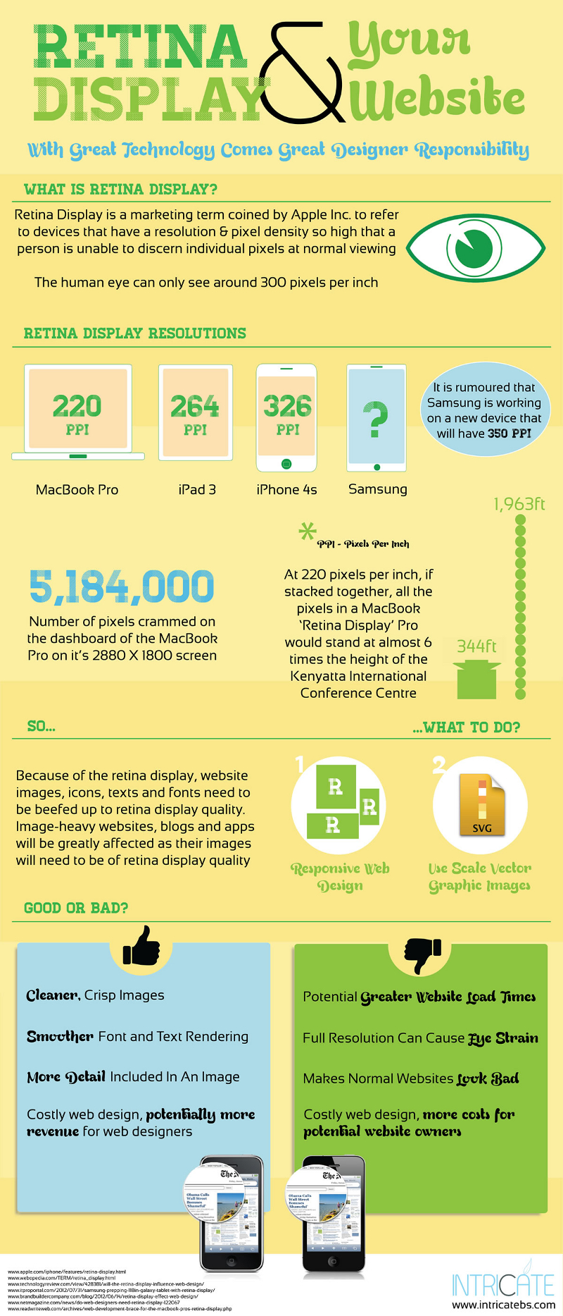
Retina Display is the marketing term established by Apple. This marketing term is referring to the monitors and devices that contain the pixel and resolution density too high -approximately around 300 or more (PPI) Pixels per Inch- on which a person is incapable to distinguish the individual pixels at the standard viewing distance. This Retina Display from Apple has actually made its first appearance on iPhone 4S, which was introduced on year 2011. The iPhone 4S has featured the 960×640 pixel screen boasting 4 times the total number of pixels, which is 326 PPI, as compared to the iPhone 4.
This new technology from Apple is more than exceptional because a standard human eye is only capable of seeing roughly 300 PPI (Pixels per Inch).
Different Retina Display Resolutions
Different forms of devices have different levels of resolution. For a MacBook Pro, the Retina Display is roughly around 220 PPI. For an iPad 3, you can view 264 PPI, while 326 PPI for the earlier mentioned iPhone 4S. To further the innovation of technology, it has been rumored that the Samsung brand is working on its new device which will be expected to feature 350 PPI. This is indeed a thing to watch out for.
As a result to the increasing Retina Display of the newly introduced devices, icons, images, fonts and texts on websites have to be carped up being suitable to the quality of their retina display. Due to this retina display, image-heavy websites, apps and blogs will greatly become affected as they will need to keep in line of the display quality.
What Should You Do?
To be able to deal with this concern, you may use the approach of Responsive Web Design in order to offer your viewers with optimum viewing experience. Another approach you may want to use is SVG or Scale Vector Graphics. You may use this form of images in order to define your images yet still with less file size. This should greatly help if you want to resort from increasing the retina display of your images.
Advantages of Increased Retina Display
Having sufficient retina display means crisp and cleaner images. It also offers you smoother text and font rendering. When it comes to images, there come more details. This is very advantageous to web designers because costly web design will possibly mean more revenue for them.
Disadvantages of Retina Display
Using this retina display also has a number of disadvantages. Using it probably means greater load times for websites. Using devices with full resolution may cause eye straining. It may also make standard websites from looking bad. Lastly, increased retina display means costly design, which means higher costs for prospective website owners.
Gauging the pros and cons of using retina display, you yourself can decide whether it is a good idea to continue its use or not.
Although millions of people visit Brandon's blog each month, his path to success was not easy. Go here to read his incredible story, "From Disabled and $500k in Debt to a Pro Blogger with 5 Million Monthly Visitors." If you want to send Brandon a quick message, then visit his contact page here.