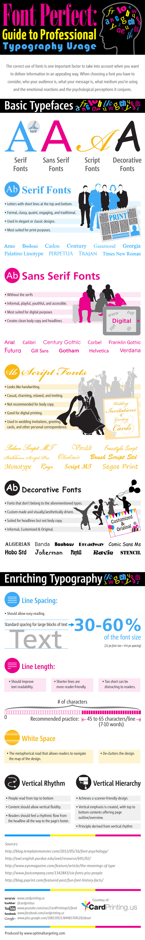
Are You Using the Right Fonts?
Believe it or not, the type of font that you use could be helping or hurting you when it comes to the information that you’re attempting to convey to people. If a font is easy to read and see for the setting it is being used, then it will help the reader understand and remember more of the information that is being read. Even the spacing of the font can make or break your content because text that is uncomfortable to read is text that will be ignored. Which fonts should you be using for your next content presentation?
Serif Fonts Are Great For Standard Printing
If you’re planning on printing out your content for people to physically read, like a book, for example, then you’ll want to utilize a serif font. These fonts all have short lines at the top and bottom of the letters and numbers and can be used in both classic and elegant designs. Serif fonts have a formality about them, yet are clean and crisp, making them perfect for printed words. With the correct amount of spacing and white space, traditional fonts like Times New Roman, Century, or Garamond will accurately and completely convey the information being presented.
Sans Serif Fonts Are Best Online
Sans Serif fonts basically mean that you’re getting a font without the serif. This means all the small lines that are on the printed letters or numbers do not exist with these fonts. Though fonts like Calibri, Gotham, or Helvetica are considered to be informal, they are the perfect body font when it comes to an online piece of content. Blog posts, web pages, and even e-mails benefit from these sans serif fonts because they are incredibly easy to read on any size of computer monitor, make the information being relayed feel accessible, and are even somewhat playful in nature. If you create a lot of online content, keep this font in mind!
Script Fonts Are Best For Formal Documents
Script fonts take cursive writing and put it into an online format. Instead of needing to hire a calligrapher for a wedding invitation, for example, you can use a script font and print out the invitations yourself and still come up with a reasonable facsimile. If you are creating a few hundred words of content or bold headlines, however, these fonts would be considered inappropriate because it would create content that was difficult to read.
Decorative Fonts Are For Headlines Only
Have you ever seen an entire e-mail written in a Comic Sans font and it drove you so nuts that you just deleted the e-mail? Decorative fonts make for attractive headlines, but they do little for anything else beyond that. These fonts are driven to be appealing visually at a glance and encourage people to read the rest of the content, but nothing more.
Keep these thoughts in mind as you’re creating your next bit of original content and you’ll create great marketing materials. The right font really can make the right first impression!
Although millions of people visit Brandon's blog each month, his path to success was not easy. Go here to read his incredible story, "From Disabled and $500k in Debt to a Pro Blogger with 5 Million Monthly Visitors." If you want to send Brandon a quick message, then visit his contact page here.