Pinterest is just one of the many social media sites that have gained popularity at a high rate in recent years. While it is not quite as popular as other social sites like Twitter and Facebook; it has experienced a steady rate of growth over the last five years. Infographics are just one type of content that is shared on this visual platform as a means of sharing valuable content with others. Here are some main takeaways from this infographic on how to use this type of media to drive pinterest pins.
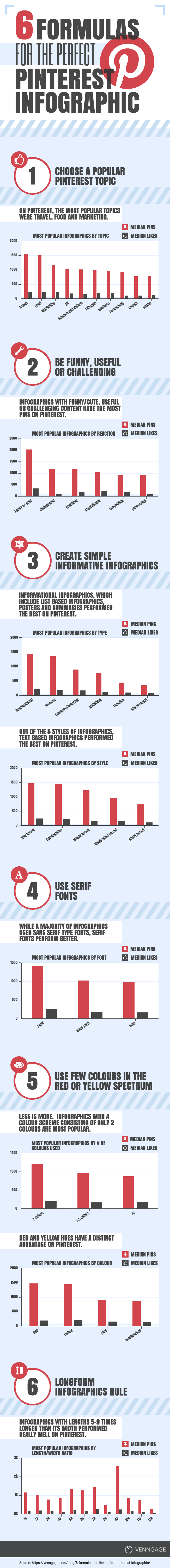
1) Topic Counts
If you want to have an infographic that is seen and shared, you need to begin by selecting a topic that is of value to a large audience. The topic of the info graphic is one of the deciding factors in how often it is shared on Pinterest. This means that you need to choose a topic that appeals to a large audience and a topic that many people have a strong opinion about. It doesn’t really matter what their opinion is exactly. Only that they have one regarding the topic you choose.
2) Choose an Angle
The type of info graphic that needs to have a unique angle. This means that the information available within the zincographic needs to take an angle of being funny, informative or challenging. This is the only way to get the attention of Pinterest users. If you really want people to notice the info graphic that you are sharing, it needs to have a unique angle that is interesting and gets people thinking or laughing.
3) Keep It Simple
The most shared infographic on Pinterest are those that are simple to follow. You do not want an infographic with charts and data that is hard to follow. All the information that is provided within the infographic needs to be easy to understand. People are looking for simple, but they also want it to have value. This can be a difficult balance to strike, but something that you need to accomplish if you want your infographic to be shared.
4) Red and Yellow
The data on the most shared infographics also shows that people are not interested in a lot of color. You should stick to colors that are within the red and yellow spectrum. This is the best way to be sure that information provided within the infographic is understood and not lost in a world of rainbow color. Keeping it simple means sticking with juts a few different color choices. Red and yellow are the colors that are shared the most often on Pinterest.
Although millions of people visit Brandon's blog each month, his path to success was not easy. Go here to read his incredible story, "From Disabled and $500k in Debt to a Pro Blogger with 5 Million Monthly Visitors." If you want to send Brandon a quick message, then visit his contact page here.